REI Away
Website app concept
Overview
How can we make it easy for people to go camping more often?
This was an individual, student project focused on executing a 2-week design process while applying fundamental UX skills. My assignment was to produce an interactive prototype of a web application for REI which includes e-commerce. The Client Brief required these features:
• Allow users to find and book camping destinations
• Provide a way for multiple campers to plan all aspects of a trip together
• Enable users to discover and book other outdoor activities to take part in while camping
• Include an interactive trip packing list
• Encourage users to purchase REI products directly from this new website
Solution
I created a prototype for a web app that would allow multiple people to plan and book camping trips with each other, reserve activities, share a group packing list, and buy camping gear directly from REI. There is currently nothing else like this available through travel planning or outdoor retail websites.
• Role: UX Designer, User Researcher
• Tools: Sketch, InVision, Photoshop, OmniGraffle, OptimalSort
• Timeline: October 2015 (2 weeks)
Research
This was a particularly complex project, so Domain and Organizational Research was my starting point. The 2014 American Camper Report was particularly useful for giving me actual data on camping demographics and trends over time. Conducting User Interviews allowed me to gain insights into user needs and behaviors related to planning camping trips.
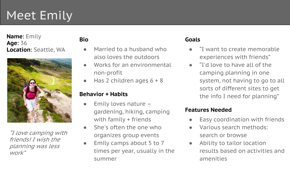
Persona
Though this was an independent project, we were encouraged to team up with classmates to combine User Research data in order to create more robust Personas. Combining forces with 3 classmates allowed me to gather User Research data from a total of 18 User Interviews. I used Affinity Diagramming to sort that data into a Primary Persona, Emily. This enabled me to focus my design on the goals most important to her.
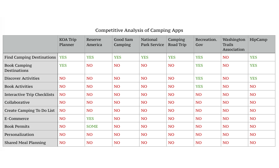
Competitive Analysis
Competitive Analysis gave me ideas about what content is necessary, and the various ways of presenting it. This exercise always helps me to understand how others have approached a similar problem, and how I can learn from their methods. Additionally, I was able to gain further insights by doing Heuristic Evaluations and Task Analysis of competitive websites.
Plan
The main focus of this project was Information Architecture – taking a complex list of requirements, and creating an understandable framework for it. I devoted much of my energy to high-level thinking about the site's content and Navigation System. Card Sorting and Use Cases were two of the exercises that were most informative to me in this project.
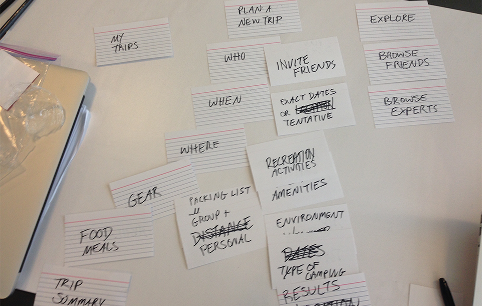
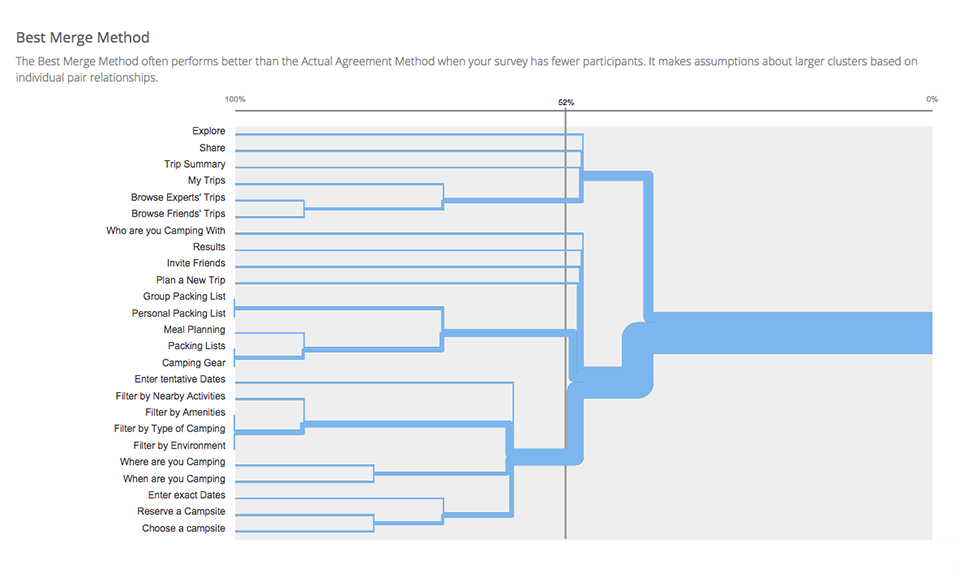
Card Sorting
I ran an Optimal Workshop Card Sorting exercise with 10 users to learn how they grouped various aspects of planning a camping trip. This was a valuable experience, because some of the results matched my expectations, but sometimes it was new. This gave me insights into users' mental models, and helped me create an Information Architecture that matched the way my users grouped subjects.
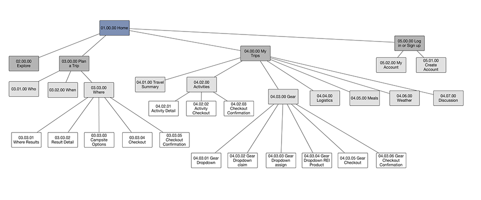
Use Cases + Sitemap
Exploring a variety of Use Cases is an essential part of my UX Design toolkit. Use Cases help me work through the User Flow process, and produce a Sitemap where I can visualize all of different parts I'll need to build in my Prototype. (Click the image below to expand it)
Design
The earlier research I did on REI's website layout and design elements was valuable during the Design phase of this project. Content Inventory also turned out to be remarkably useful during this stage since I had so many screen states to keep track of.
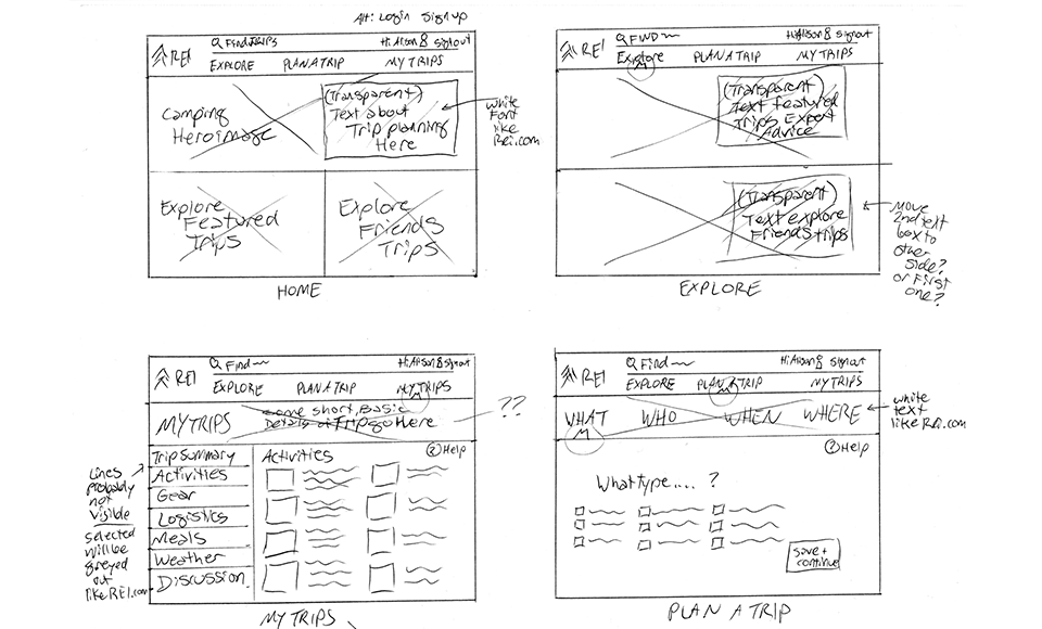
Sketches
Sketching allowed me to explore a number of different layout options and Design Patterns for the types of screens I planned to create in my prototype.
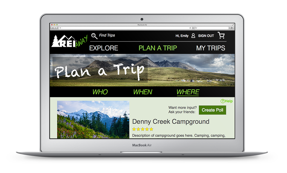
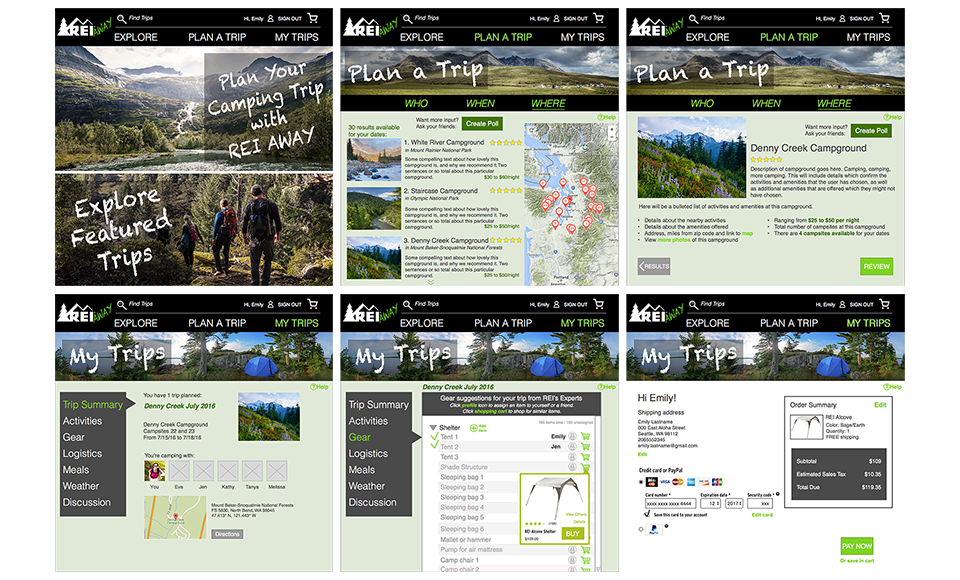
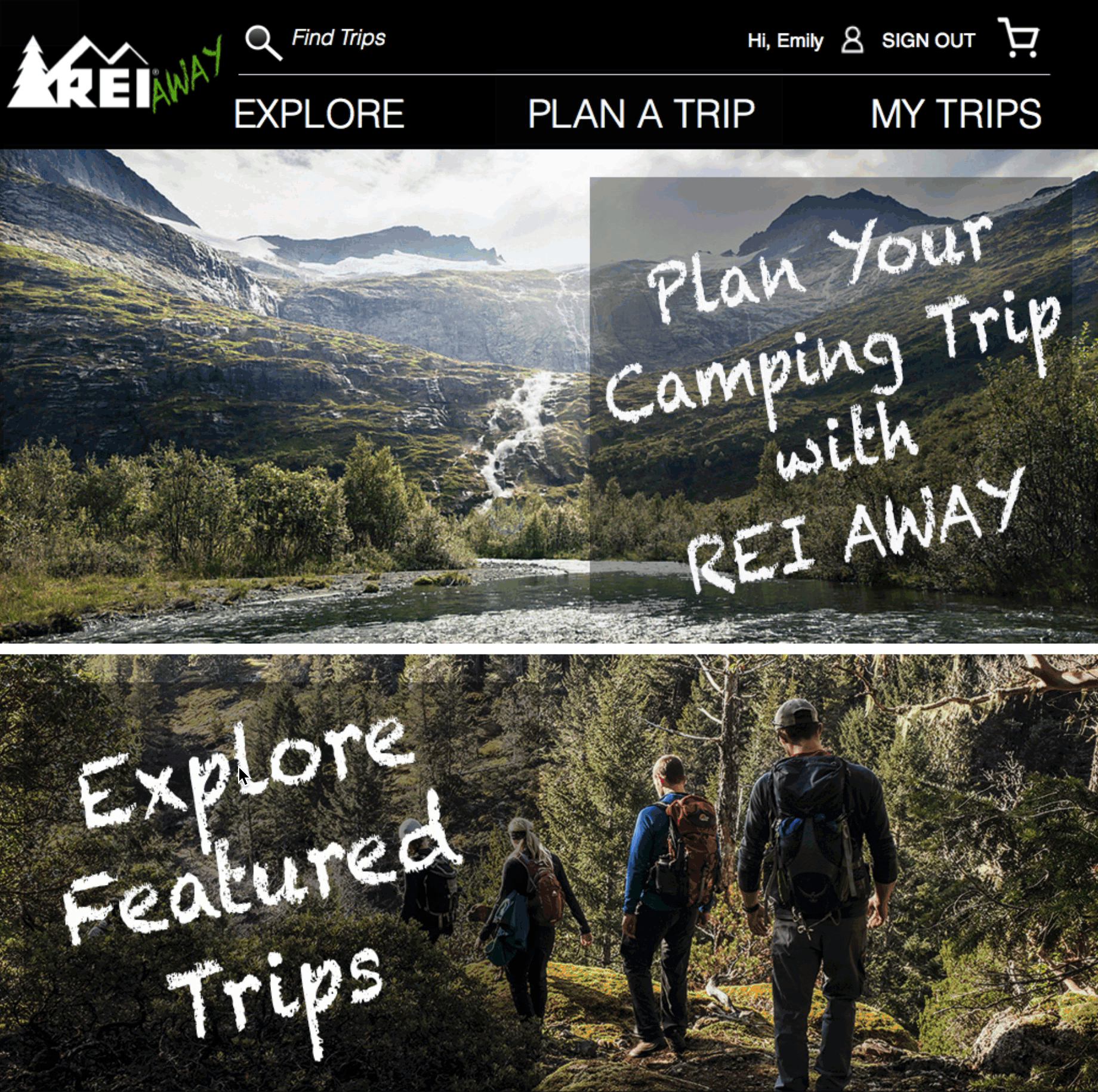
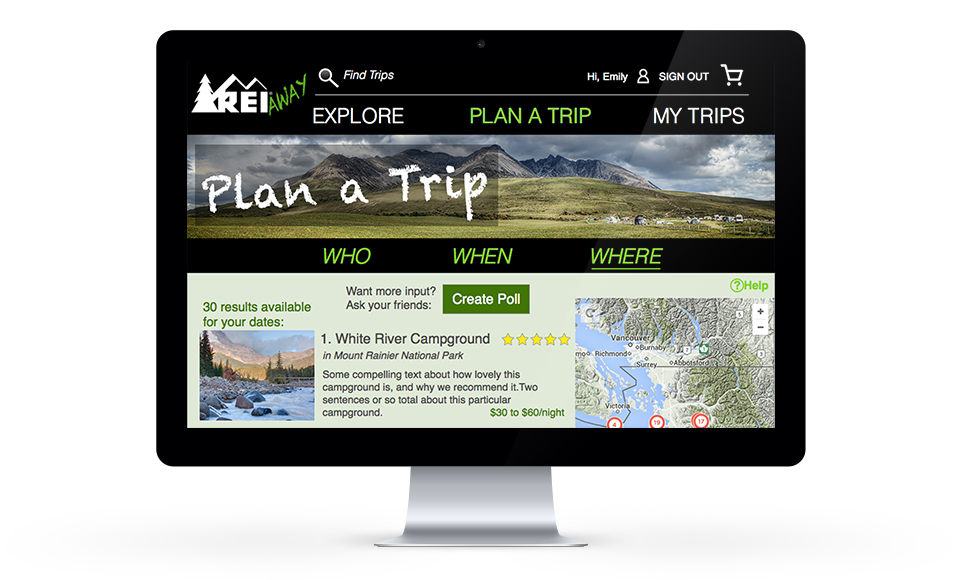
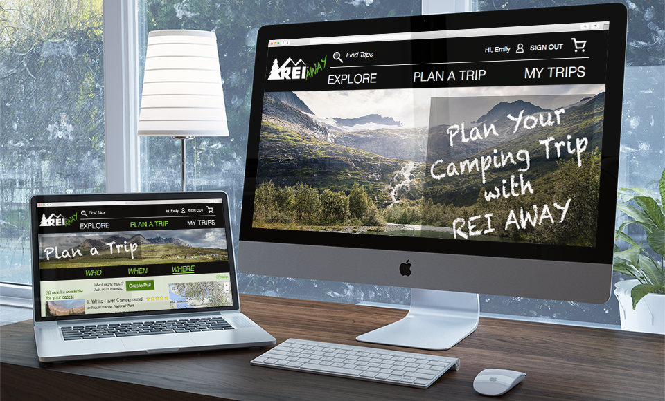
Visual Design
These are some of the screens that went into my prototype for testing. They're higher-fidelity wireframes, but I certainly don't consider these to be the final Visual Design. The focus of this exercise was more about creating a robust Information Architecture for a complex product.
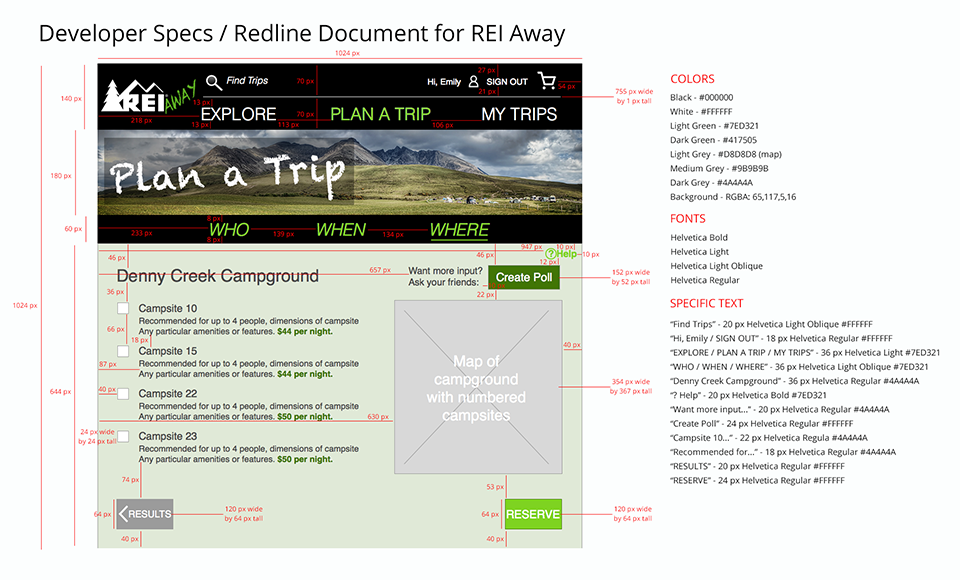
Dev Specs Redlines
In order to get more practice collaborating with developers, I created a Redline / Dev Spec of one of my screens, and shared it with a developer to make sure that I understood her needs and requirements. She said this document was very useful to her, and that she'd know exactly what to build based on this.
Test
This project gave me a lot of practice with Usability Testing and the subsequent design iterations. I started Usability Testing at the beginning of week 2, and was able to conduct 7 tests total. Each time that I conducted a Usability Test, I came away with insights that allowed me to refine my original design considerably. The prototype decreased from 50 screens down to 37, the task flow efficiency increased, as did the available functionality.
Result
I believe that this website fills an unmet need. It would help busy people like Emily who wish they could plan camping trips more easily. Having a framework that streamlines the complexities of locating and reserving a camping spot would encourage more people to get out of the city and enjoy the outdoors together.
If this website were to be launched, I would measure its effectiveness using the following success metrics. Quantitative: number of profiles created, number of trips planned, frequency of use after first trip, number of sales of camping-related equipment at REI through REI Away. Qualitative: overall user satisfaction, users feel empowered to camp more often as a result of using app, likelihood of user to recommend to a friend.