Baby Time
Mobile app concept
Overview
How can we help new parents to feel more knowledgeable and in control?
This was a rapid concept piece focused on conducting User Research, practicing user-centered design, and building a design from data to fit user mental models. It shows how I approach a design problem when I'm not given much in the way of requirements or constraints.
My assignment was to create a mobile app for my classmate, Wilbur. The challenging part was that there wasn't a Client Brief. The requirements were to discover and address a user need, and practice low-fidelity, rapid prototyping of a mobile app.
Solution
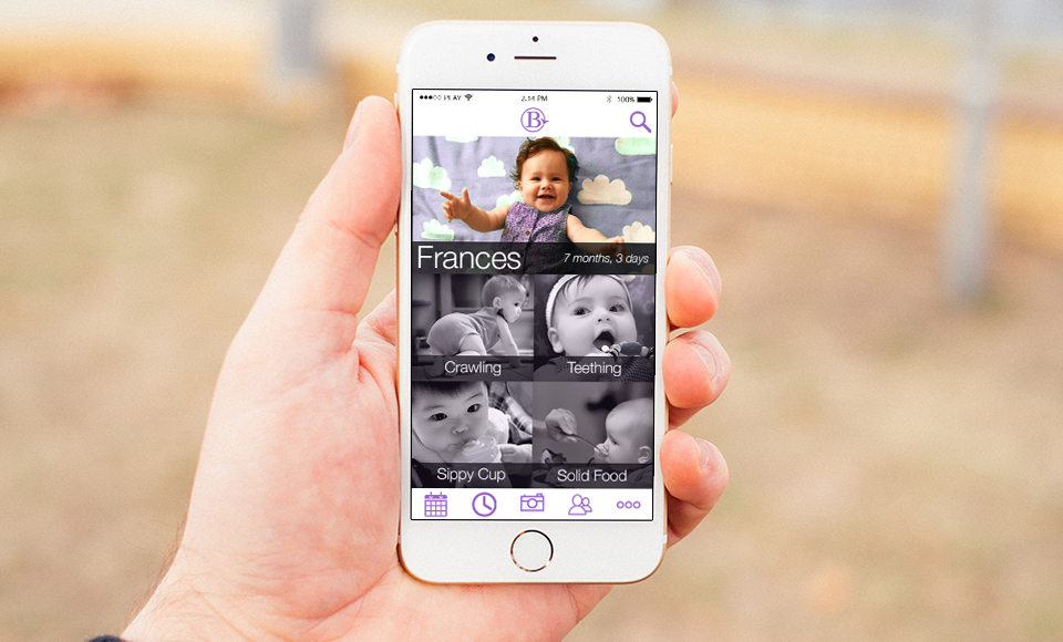
I designed an app that would empower busy, new parents, like Wilbur, with personalized info about their baby's developmental milestones. My research uncovered a need for concise and timely information about baby development, so that new parents can have one less thing to worry about. What sets this app apart from others in this field is the understanding that new parents have limited time and attention spans. They don't want to dig through unrelated information or unnecessary features to get what they need.
• Role: UX Designer, User Researcher
• Tools: InVision, POP (Prototyping on Paper app), Illustrator, Photoshop, OmniGraffle
• Timeline: September 2015 (1 week)
Research
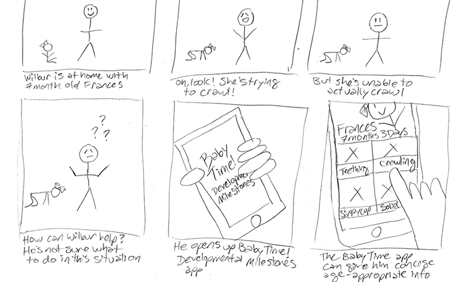
My research began with a detailed User Interview where I had to discover exactly what Wilbur's needs were, and how I could create an app to improve his life. I had a robust Ideation phase knowing that most of the ideas would be discarded, but that I needed a wide range of good options in order to discover the best one.
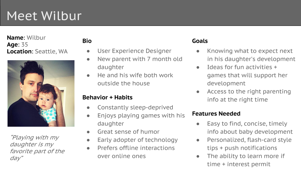
Persona
The next step was to translate my research into a design solution for Wilbur. After my evaluation of about a dozen potential ideas, I decided that the best idea to pursue was a baby development milestone app. This would allow Wilbur to have a richer experience of an activity he already enjoys – spending time with his 7 month old daughter, Frances.
I modeled this User Research into a Persona. This exercise helped me to focus on Wilbur's behavior, habits, goals, and the features he would need in an app. Based on an analysis of his behavior, and how he would actually use the app, I discovered that it was very important to tailor this app specifically to a busy, working parent like himself.
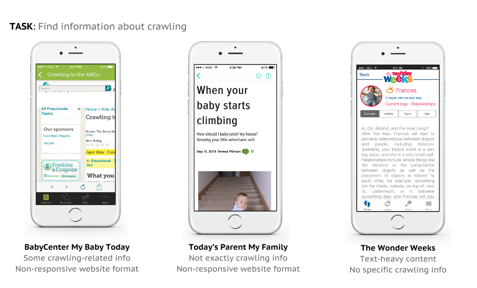
Competitive Analysis
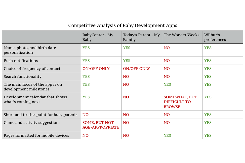
Competitive Analysis confirmed my suspicion that none of the other baby development apps were created with a busy, working parent in mind. Many of them were either based on books and therefore too text-heavy and complex, or too bloated with additional features that Wilbur wouldn't have time to explore and use.
Task Analysis
Doing a Task Analysis exercise gave me additional insights into other baby apps, and showed me that they weren't designed for someone like Wilbur. In a crowded marketplace, analysis of similar apps is required; it helped to focus my design and its features. Each time I had to make a design decision, I reminded myself of Wilbur, and how he would interact with the app I was creating.
Plan
During the initial planning stages, I conducted a second round of User Research which included asking Wilbur about specific features I was considering for the app, and whether they would add value or not. This research and analysis allowed me to refine the number of features my app would include.
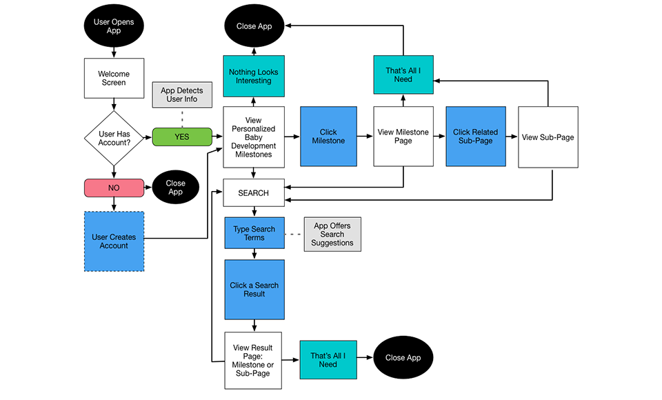
User Flow + Use Cases
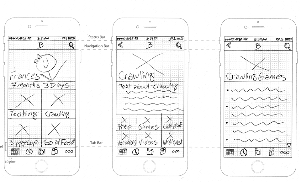
I took some of the Scenarios that I created and reconsidered them as Use Cases to make sure that my app included all of the necessary parts. Then I examined additional Use Cases including account set-up and push notifications. I plotted out a User Flow Diagram for a crawling Use Case, and included some alternate paths in case the sleep-deprived parent missed the easiest path to the Crawling Main Page. Creating these Scenarios, Use Cases, and User Flow Diagrams helped me envision the app's overall design framework as well as its flow.
Design
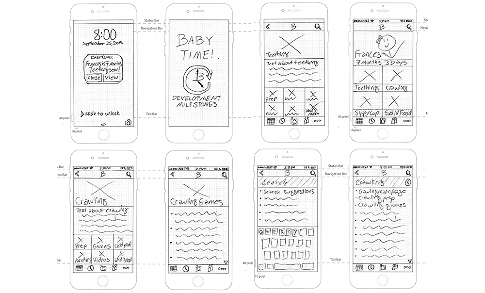
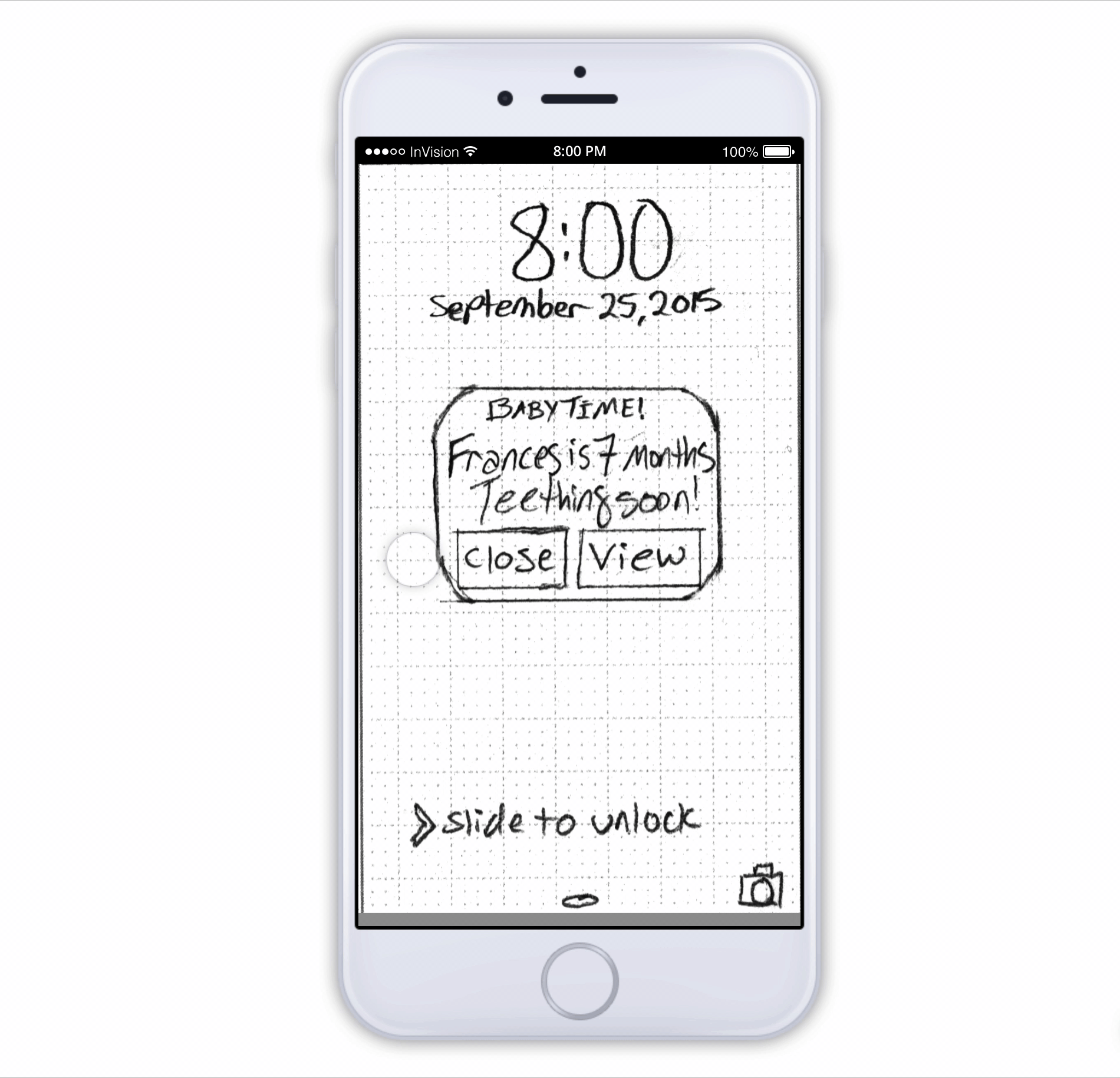
The next stage involved a good amount of sketching. I sketched Storyboards, paper Prototypes, some initial logo possibilities, and the User Interface iconography.
Rapid Prototyping
I had a robust UI Ideation and Sketching phase to try out many ideas, and discover the best path to pursue. Creating a low-fidelity, clickable paper Prototype enabled me to test out my ideas rapidly. Once I reached the Usability Testing phase, I discovered that the very low-fidelity level of my prototype encouraged constructive comments and improvements on the framework, which is what I wanted at that stage.
Test
I took advantage of the rapid prototyping features of InVision to initiate Usability Testing at an early stage in the design. Watching Wilbur and other testers use the app, and hearing their thoughts about the interactions enabled me to add a number of improvements and refinements to the app.
Result
Based on the responses from my Usability Testing, I believe that my app fills an unmet need – that of a busy, working parent who wants to know what to expect in their child's development, but who have very little time to read books or long websites on these topics. This app won't be bogged down with unnecessary features that they won't have time to use (and might feel guilty about not using). This app would be gender neutral (for both parent and child), and aimed toward working parents.
If this app were to be launched, I would measure its effectiveness using the following success metrics. Quantitative: number of downloads, frequency of use after download, and time spent interacting with the app. Qualitative: content of user reviews, overall user satisfaction, whether users feel more informed as a result of using app, likelihood of user to recommend to a friend.